Yet another subject that was approached with trepidation.
Having virtually no experience of drawing, and no formal tuition the thought of drawing the human form seemed an impossible task.
Initial drawing session of a personal object (took place at the start of the course prior to the Life Drawing class). This session was good preparation for the life drawing class. My personal object was one of my 18 month old granddaughter’s toys. I was pleasantly surprised with the result. I was please that this session had already taken place to give me an opportunity to draw an object that I could physically see and touch.
Looking at the frame supporting the toy the clamps reminded me of an eye and mouth. Although this was perhaps not part of the brief I included my imaginations’ into the picture adding a bit more surrealism over and above the weird image that I had already created.
I learnt a lot from this initial session. I didn’t do an initial sketch which wasted time further along the way. The proportions of each element of the toy were not considered before starting to draw. After many corrections the drawing ended up being reasonably similar to the object, but if I had done some brief sketches first the problems would have presented themselves before adding finer detail.
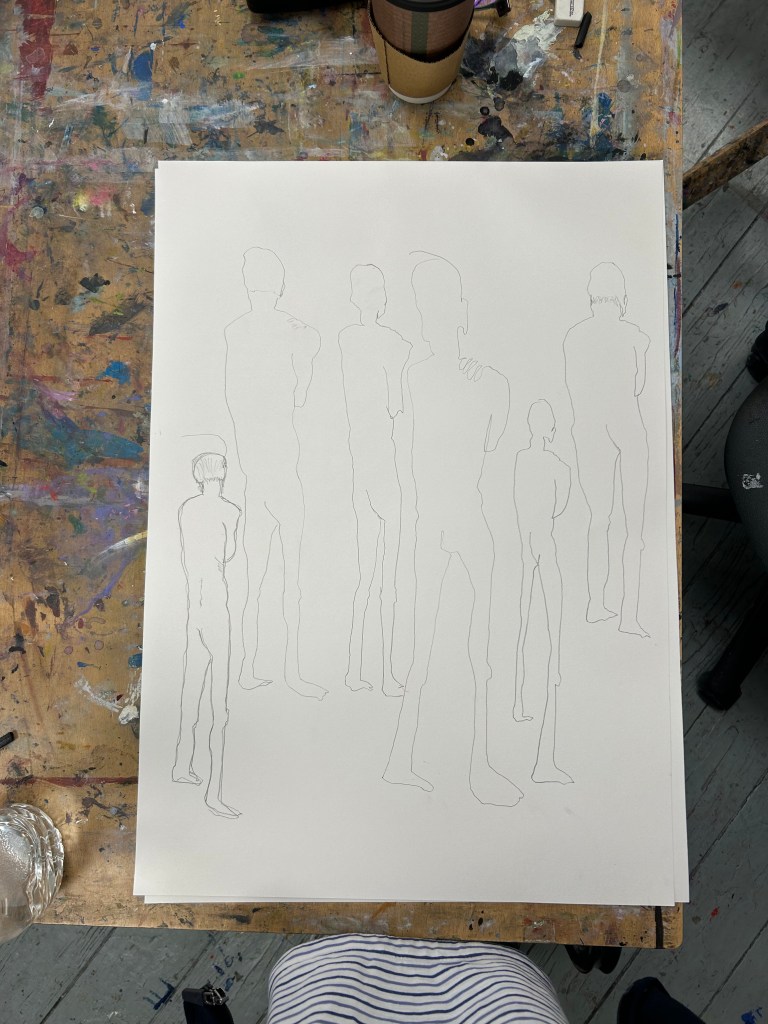
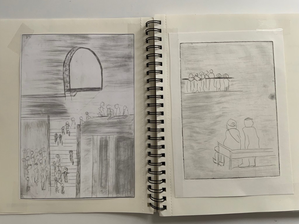
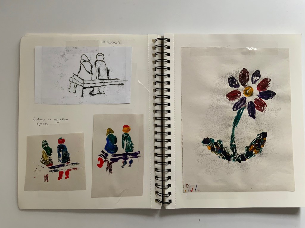
Additional sketching of people formed part of the printmaking classes, which was also very useful preparation for the life drawing class. See end of this post or the printmaking post for images.
Later in the term, Life Drawing!
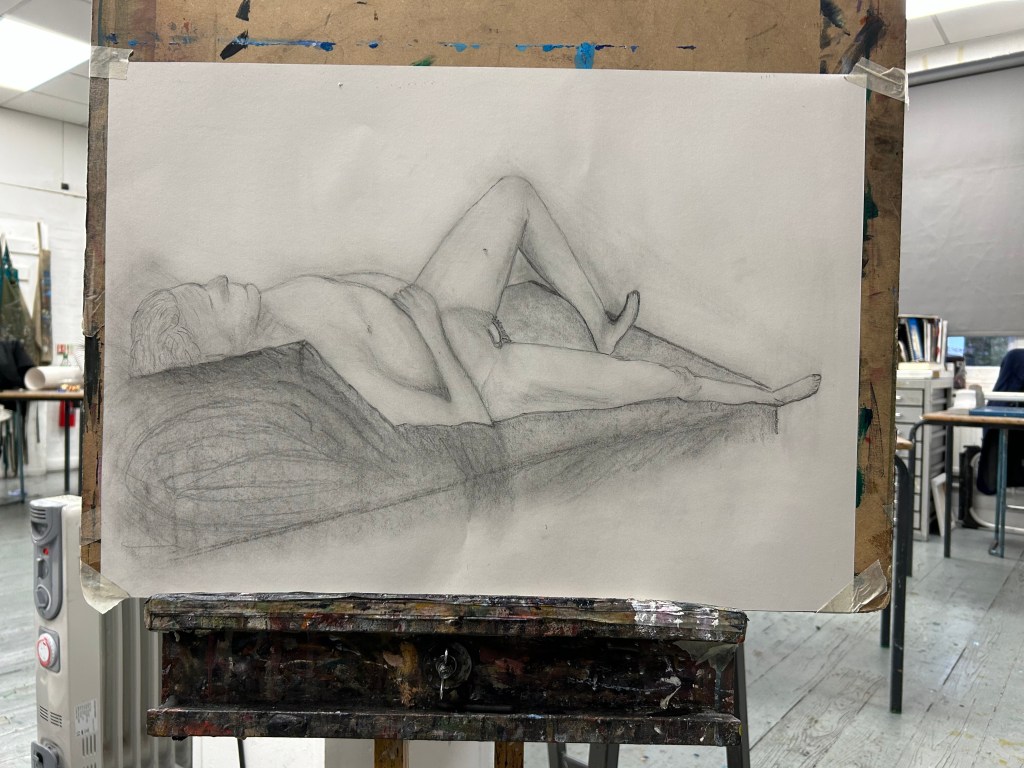
My expectations were low when the class started. Although I made mistakes I learnt a lot about the technicalities and structure of the human form and made a determined attempt at a realistic representation of Kit (the model).
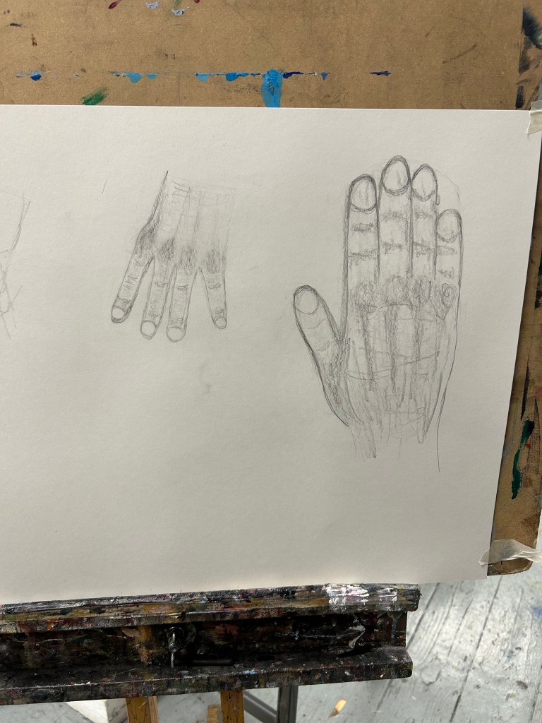
I was particularly please with my drawings of hands, and also the facial section of the final drawing.
The initial line drawings using a technique of drawing without looking at the paper was interesting, although not true to life the and result was better than anticipated.
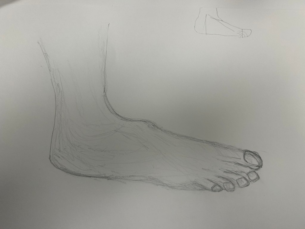
After the technicalities or hands and feet were explained the task seemed less daunting. The smaller hand is a copy of Kit’s pose, the larger one a copy of my own hand.
Some guidance was gratefully received to make the drawing of the foot more acceptable
The final drawing was reasonably successful. I found the feet hard, especially taking perspective into account. The cushion could also have been improved with additional tuition/time.
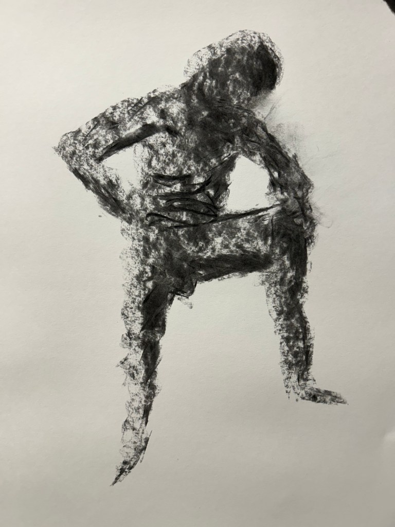
A quick charcoal drawing was also part of the session. I think this drawing was the best of all of the work done that day. It captures an atmosphere in addition to the actual art depiction
Overall I was pleased with my progress. I learnt from mistakes and assistance from Gunther and will strive to practice drawing more often, both objects and people to improve my skills.
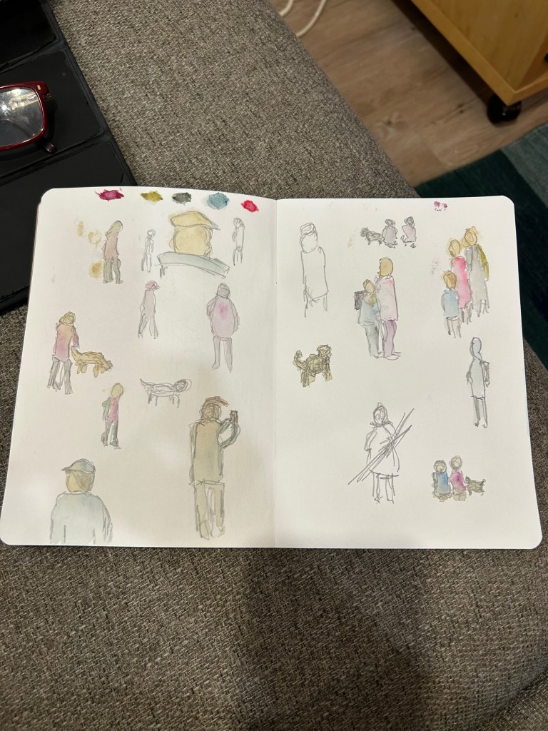
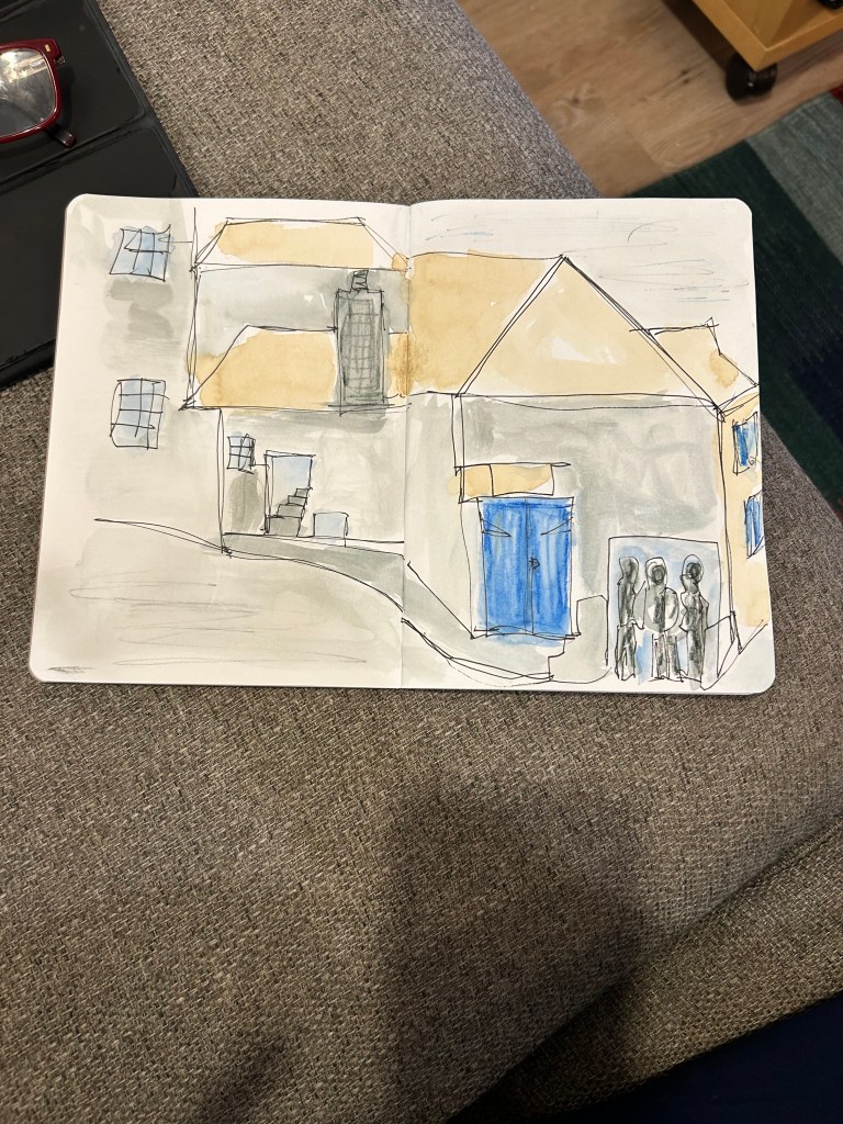
More sketches, some with a bit of watercolour:
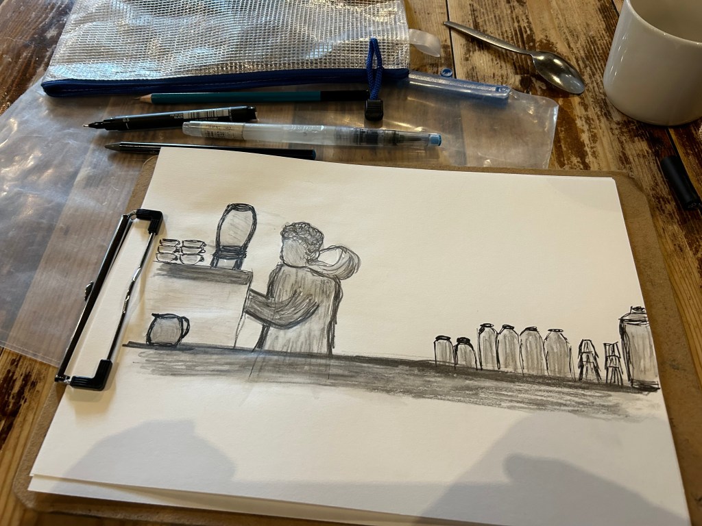
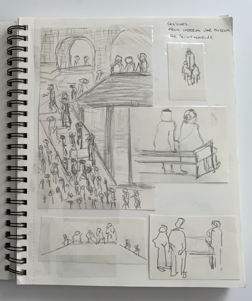
I used the same skills in week one of printmaking when sketching people at the Imperial War Museum
Using the same subjects and transferable skills in different classes enhances my satisfaction with the course and my learning experience, and allows me to recognise the importance of all of the individual elements of art and design, and how they interact.
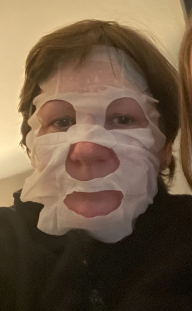
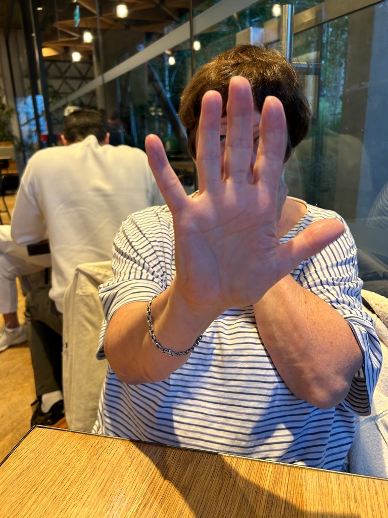
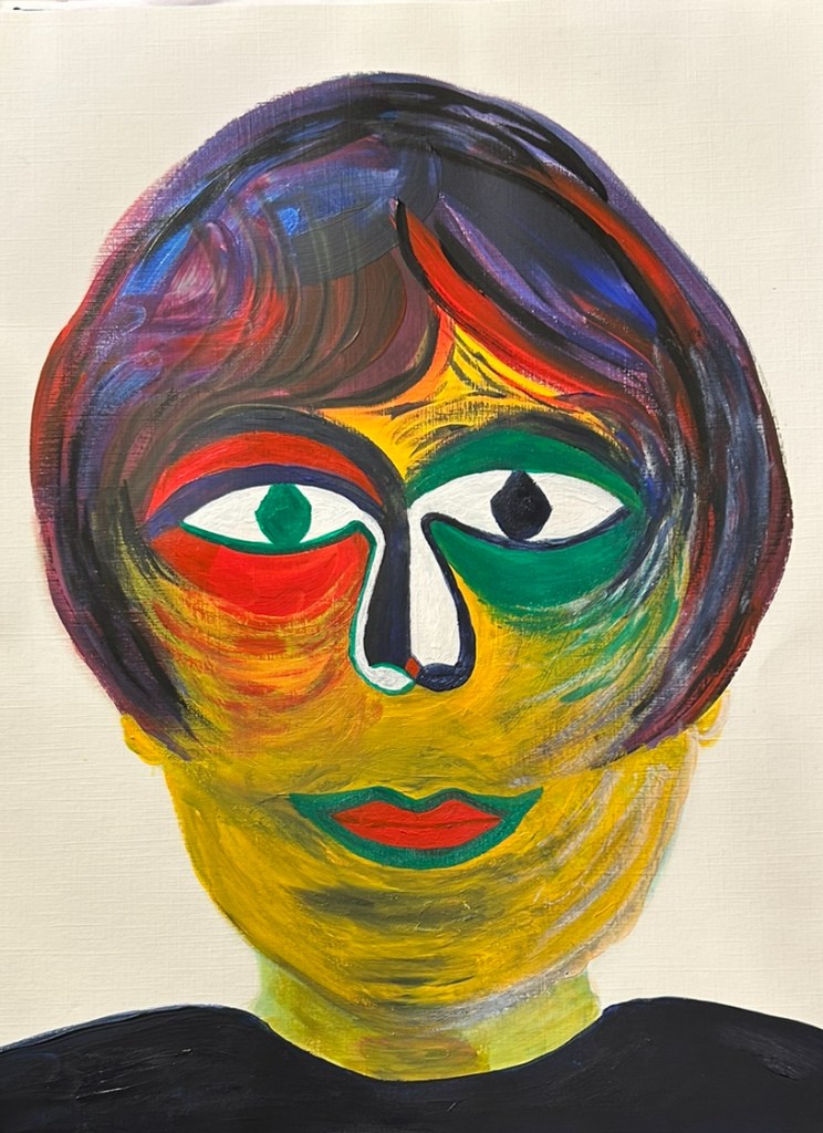
To use photography to explore and challenge conventional ideas of self representation. Use photography to reveal the multifaceted nature of identity. Delve into the deeper layers of self-identity and creativity.
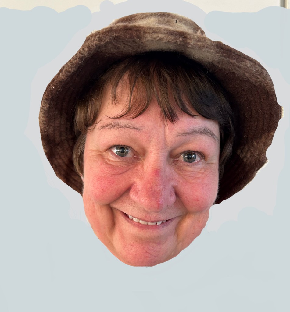
Keeping with my personal work on the theme of identity I selected photos that could be used to depict loss of identity and how this can affect how others perceive you.
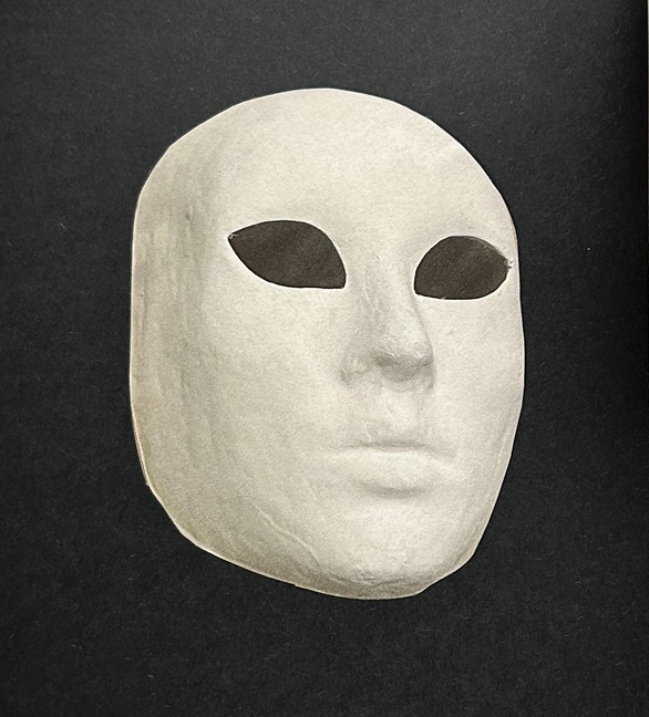
Hidden facial features, removes the memorable features that enable you to recognise people. Makes the person behind the mask ‘faceless’, losing their identity.
2. Defaced identity document, removes the official identity.
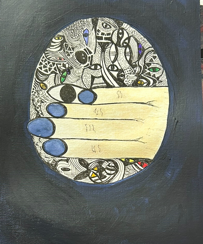
3. Hiding behind a hand or hands, covering up and seeking to become invisible
4. Faceless and totally unidentifiable
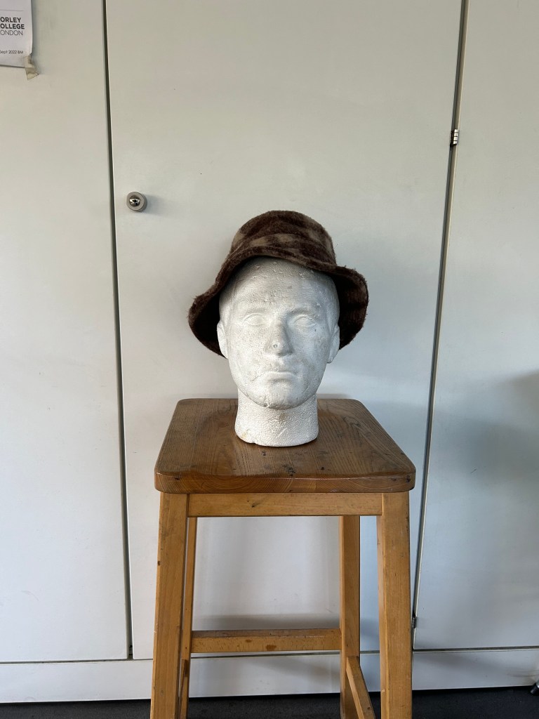
5. Hiding behind a prop. Using items of clothing that would not normally be worn by the person creates confusion in the eyes of the viewer, potentially stripping the individual of their known/usual personality
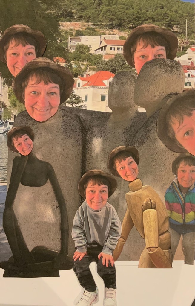
To finalise the project I decided to use the same image multiple times within one photograph. This leads the viewer to question why there are so many duplications of the same person, all identical. Although the picture shows a smiling face, which could suggest a normal happy structured life it actually represents the loss of individuality, the very thing that makes us uniquely human.
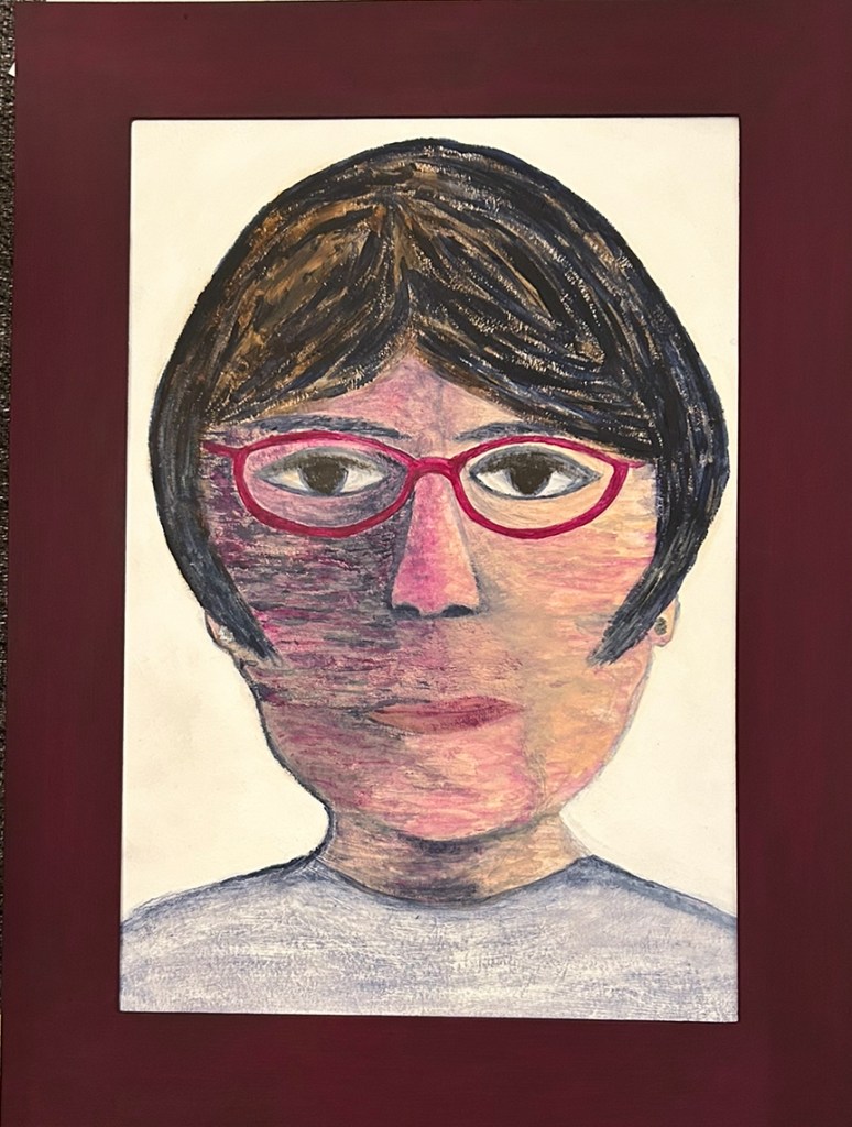
Additional self portrait images. Work from other classes demonstrates the interchangeability of ideas within all of the art and design disciplines.
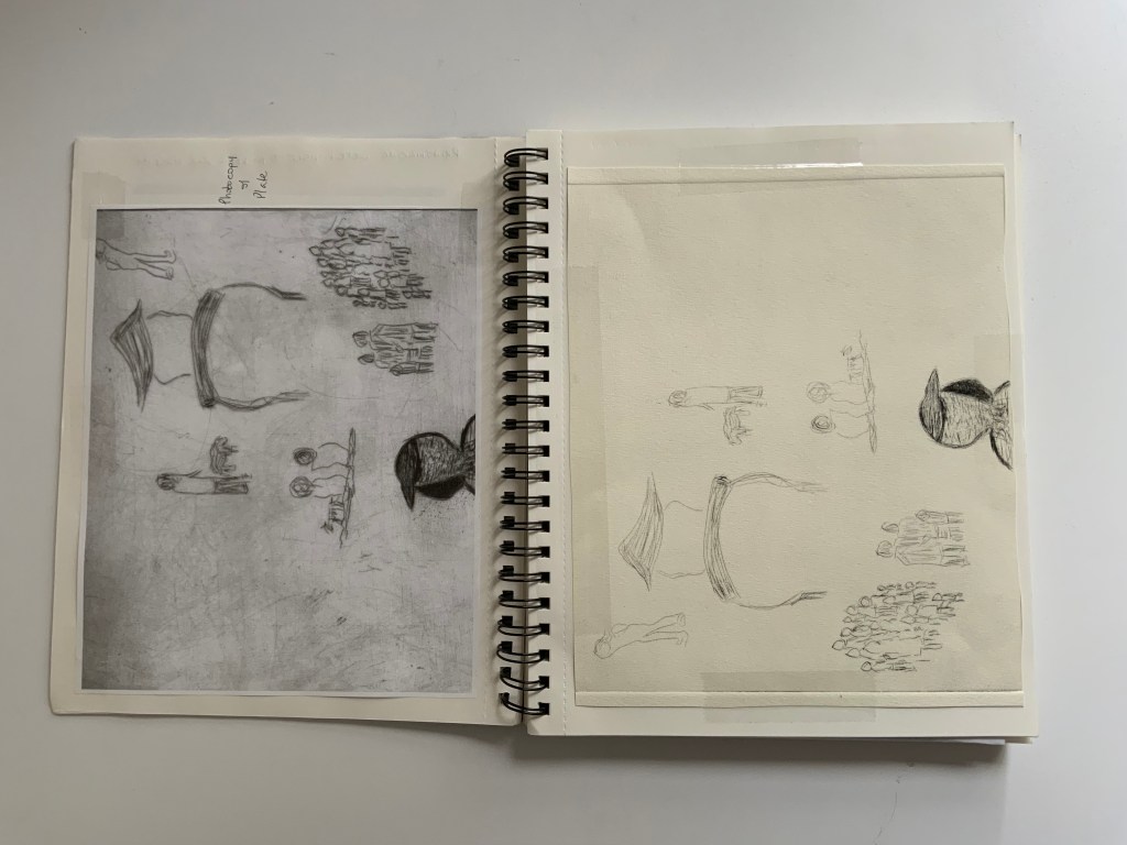
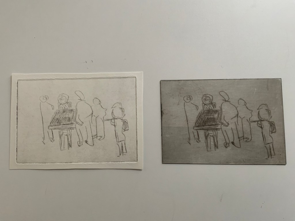
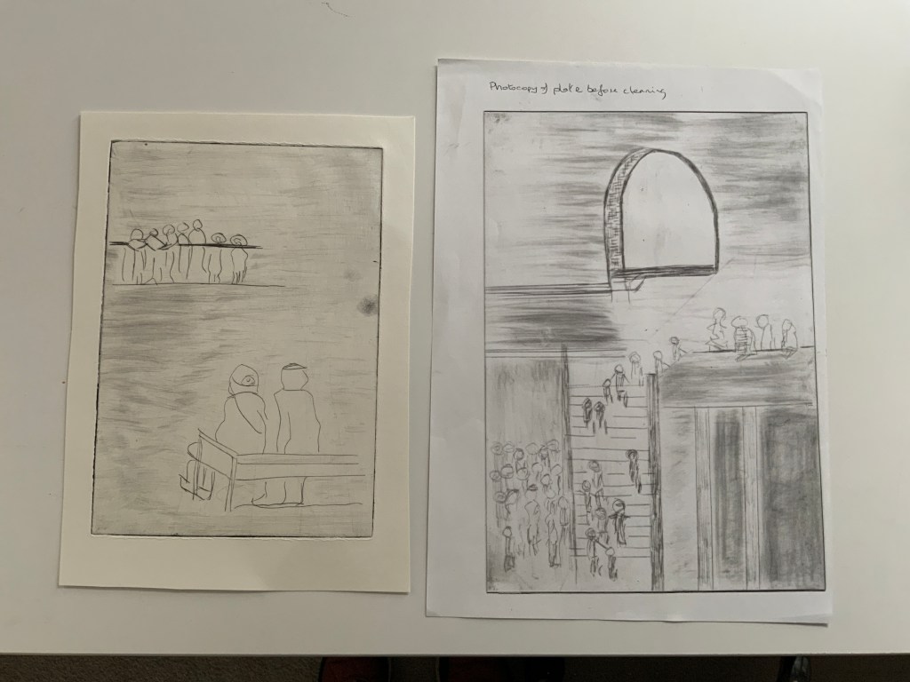
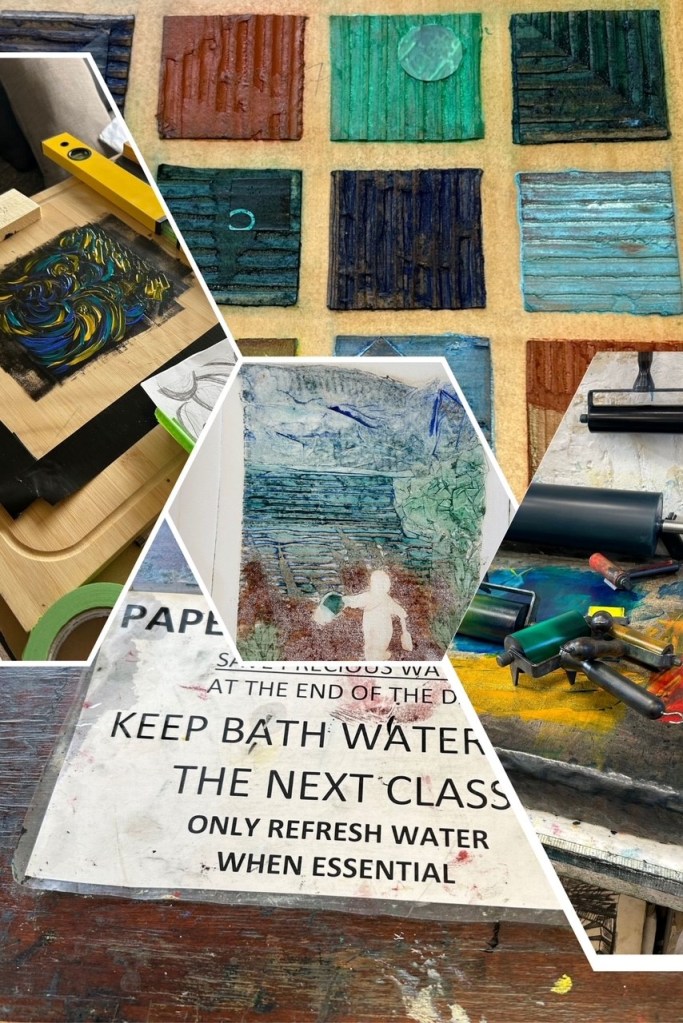
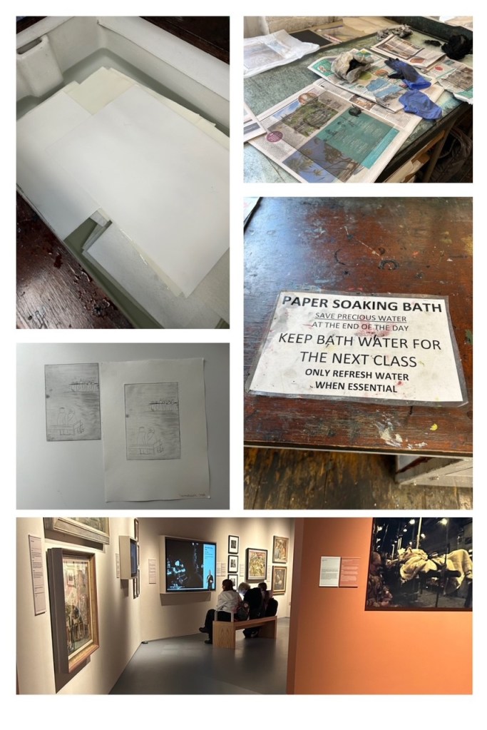
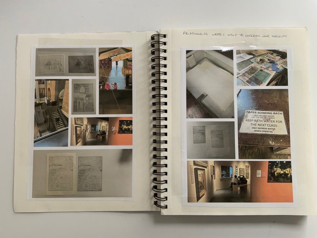
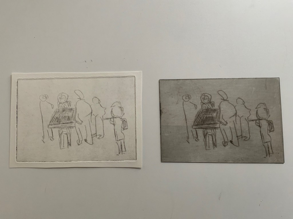
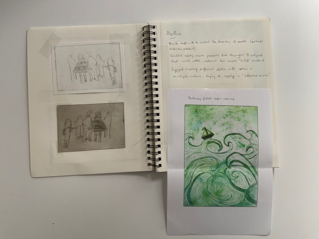
Our first week in the printmaking module started with a visit to the Imperial War Museum. We spent the morning sketching images that we could then use to create dry point etchings.
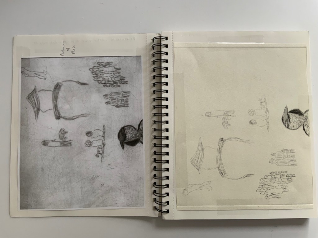
We continued with dry point etching producing a number of plates to print in the studio.
Starting with black and white prints we then graduated to introducing colour.
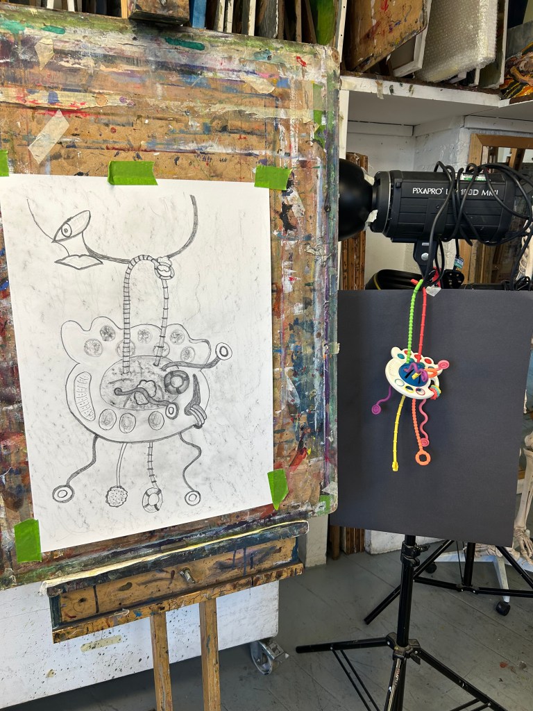
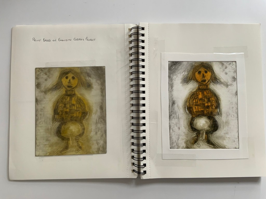
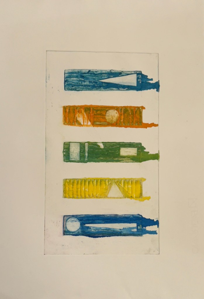
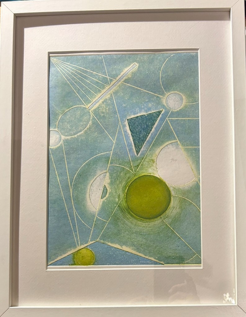
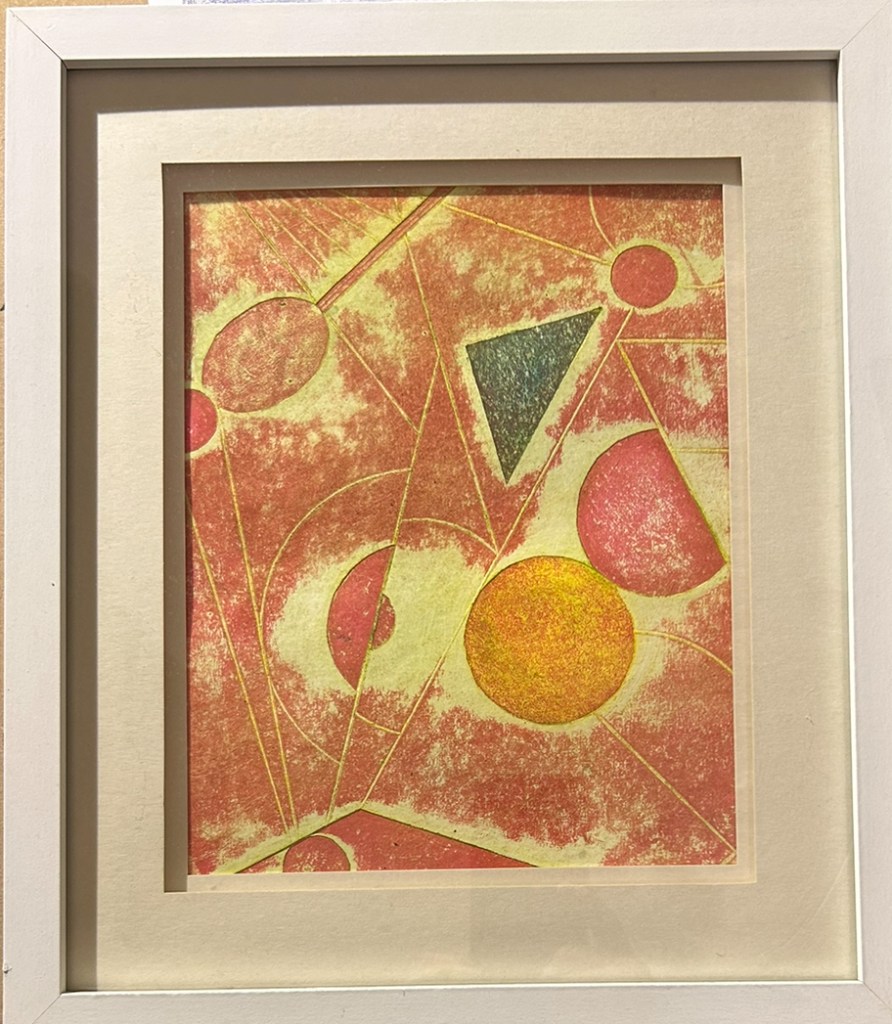
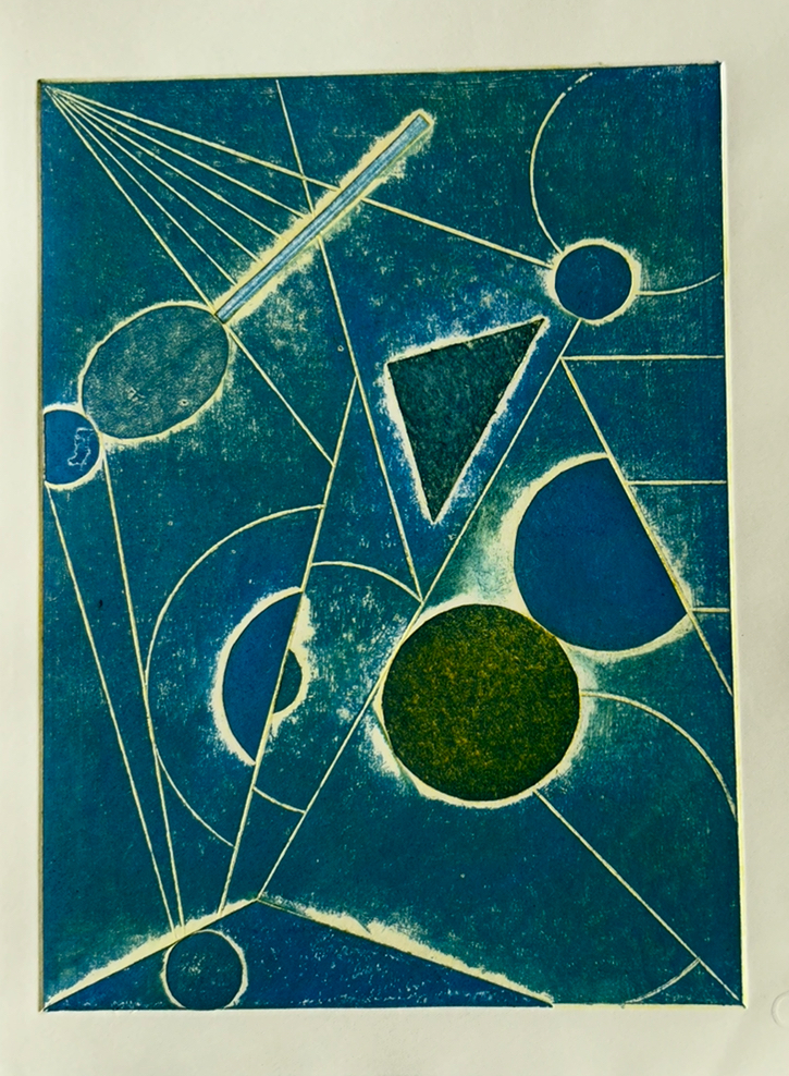
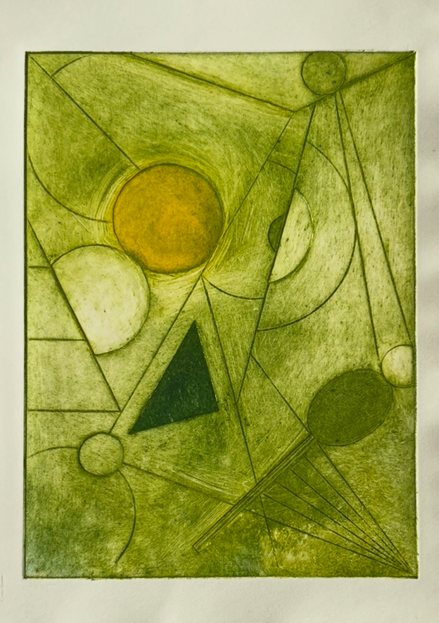
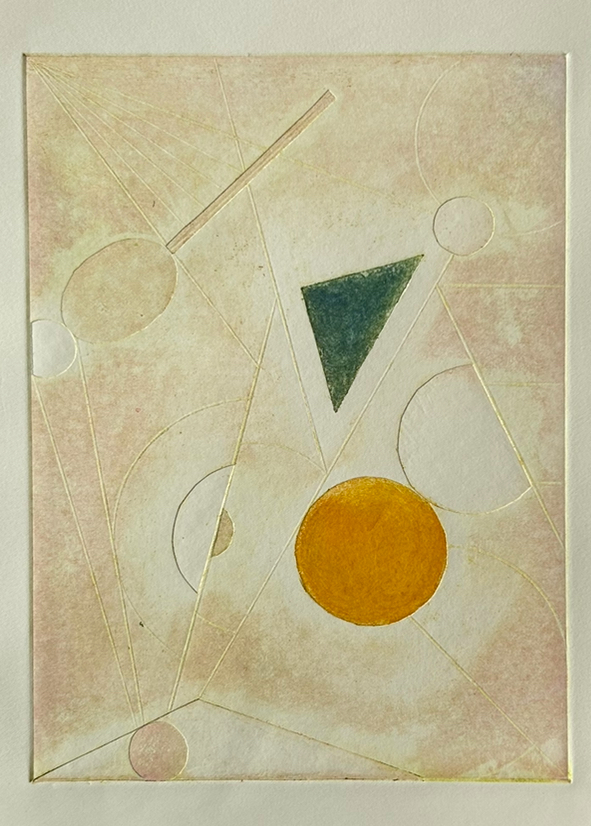
I chose to replicate the 3D model made in the Exquisite Corpses class using black for the outline and orange for the central section.
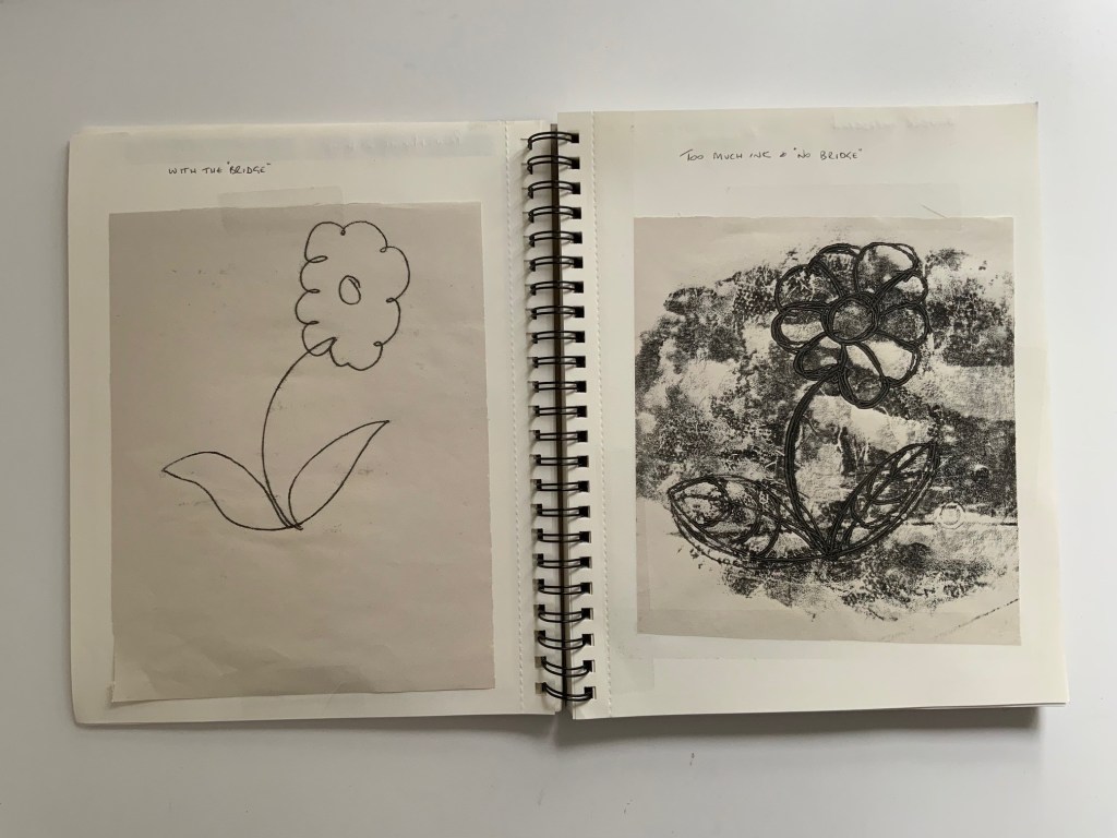
For homework we were tasked with producing some prints from a basic printing kit.
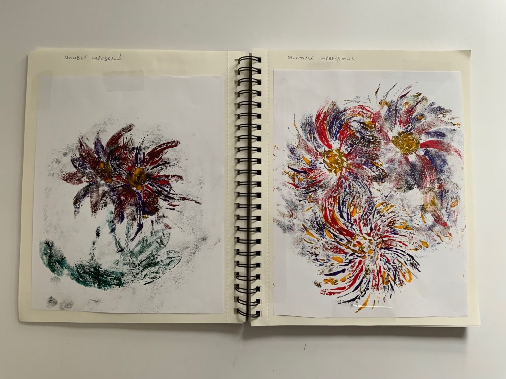
Applying the correct amount of ink was tricky, better results were obtained when assisted by a home made ‘bridge’ using 2 blocks of wood and a spirit level. Applying colour and using multiple ‘prints’ from the same paint source produced nice results. A coloured print using the negative spaces made from the original pressing was also successful.
Collography
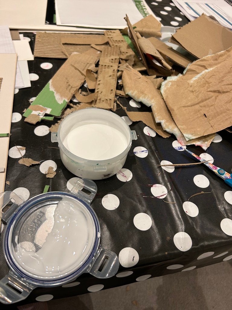
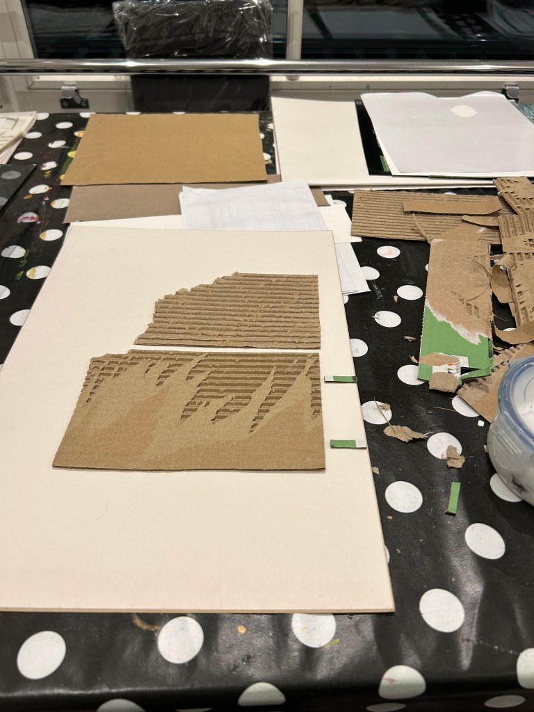
Our initial attempts at Collography were based on items available in the studio to give experience of what sort of end result can be obtained from using different textures and surfaces.
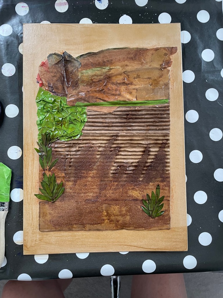
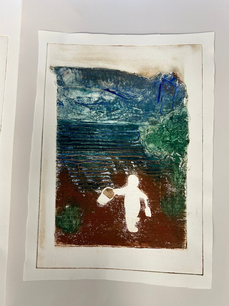
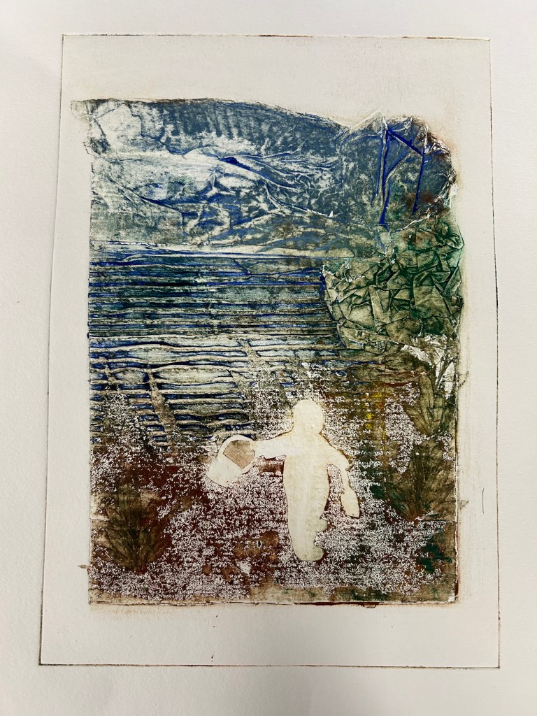
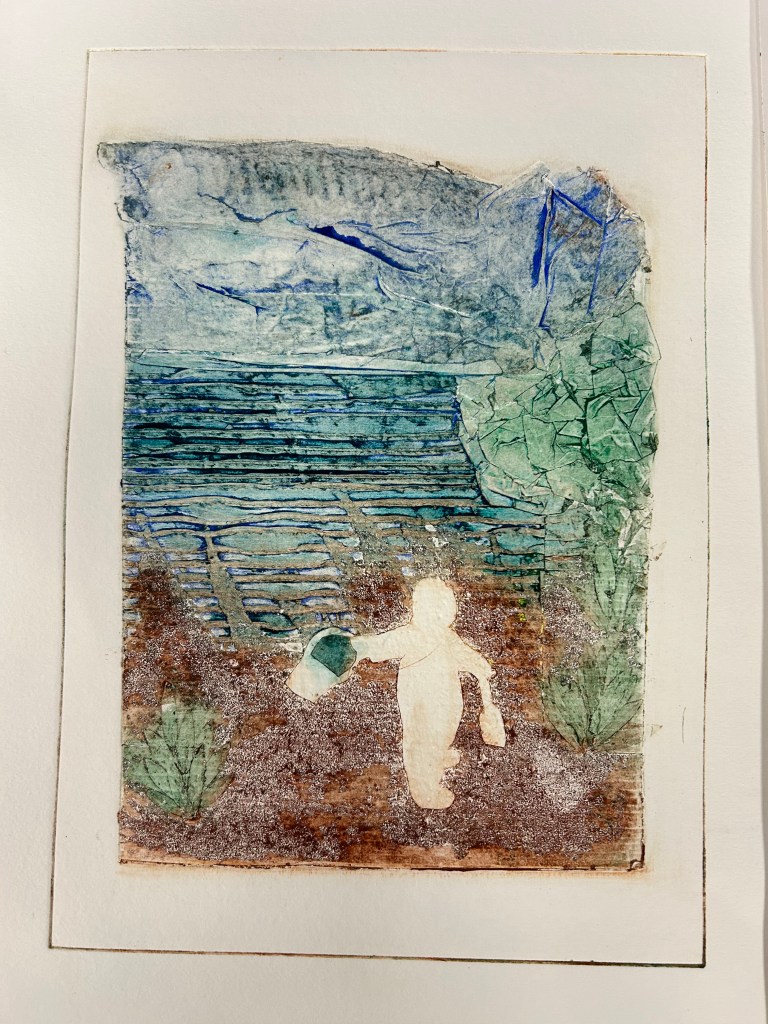
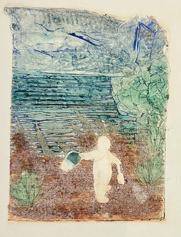
The end result encouraged me to explore using different materials to portray a beach scene. I worked at home using materials to hand in the house with the pva waterproof glue and shellac provided by Brian.
My materials included cardboard packaging, masking tape, tissue paper and sand. I also included some leaves picked from a bush in the garden. All items were glued to the board and various numbers of coats of shellac were painted on each section to attempt to produce varied levels of saturation of ink during the printing process.
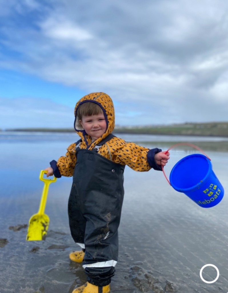
I included a cut out image of my grandson aged 18 months on a visit to the beach on a rainy day. I used a shiny cardboard for the image to allow removal of ink from that section of the print.
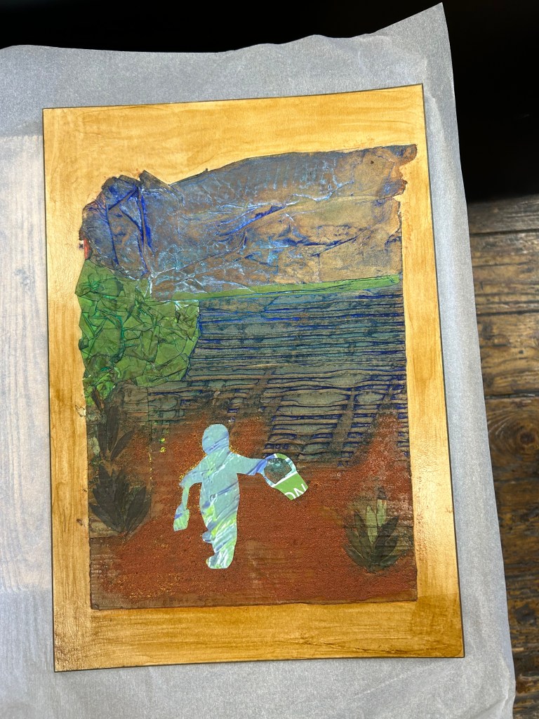
The 1st print was overloaded with ink, however the end result was extremely pleasing. To help my painful hands I decided to experiment with ghost prints and found the results were exactly as anticipated. I then continued printing further copies with some ‘selective’ inking.
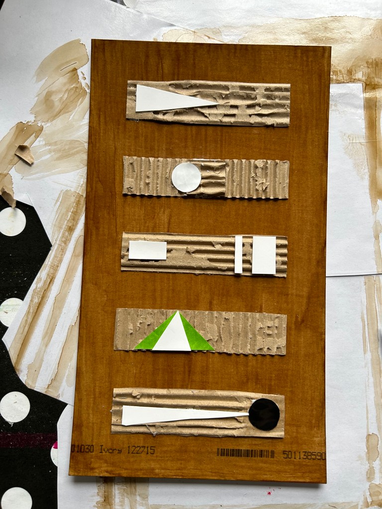
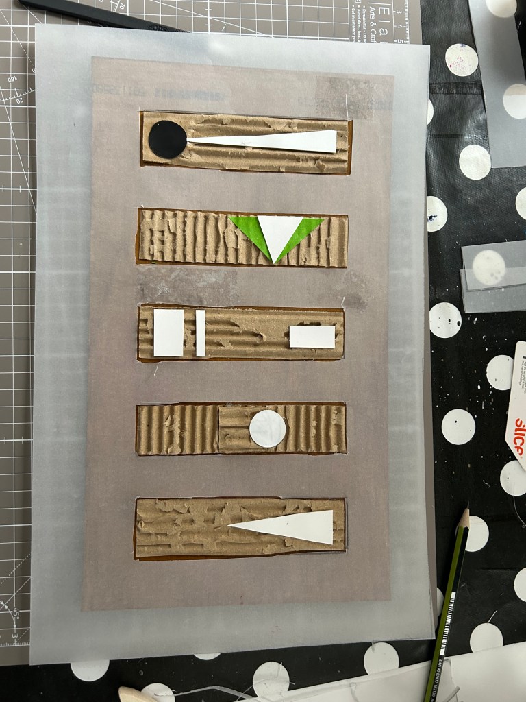
In the same week/session I made 2 additional plates.
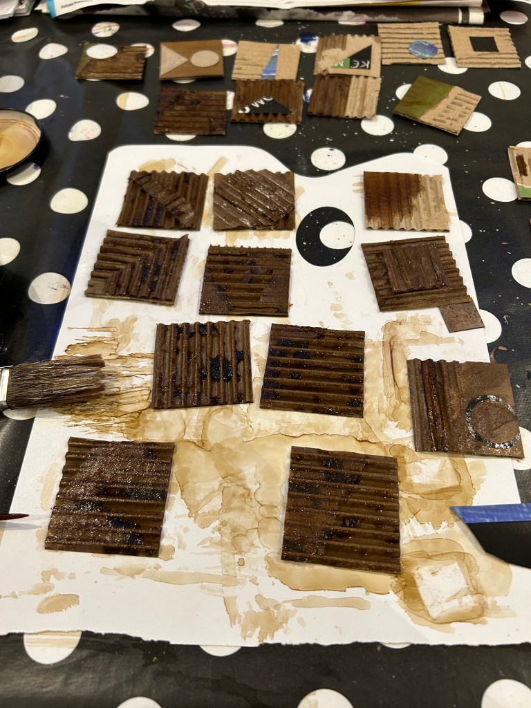
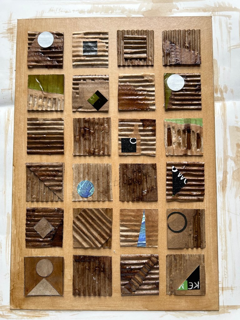
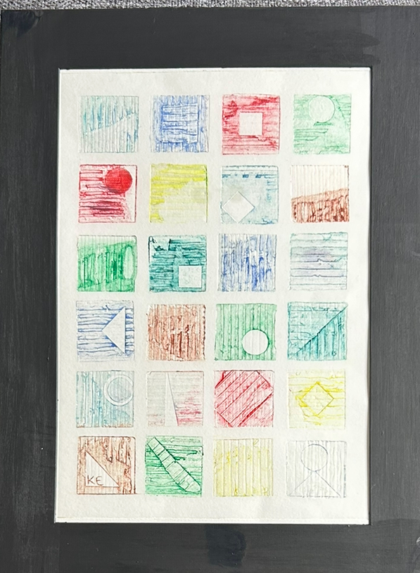
A geometric panel of 5cm squares with differing textures and shapes added onto the cardboard base.
Finished plate ready for printing
Note, my initials scratched in reverse ready for printing.
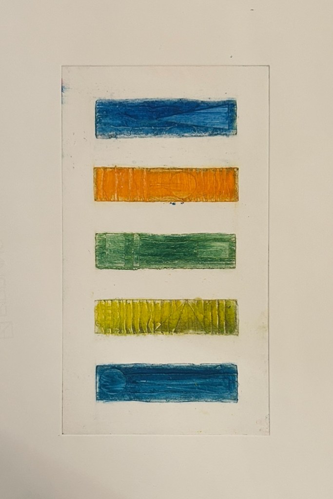
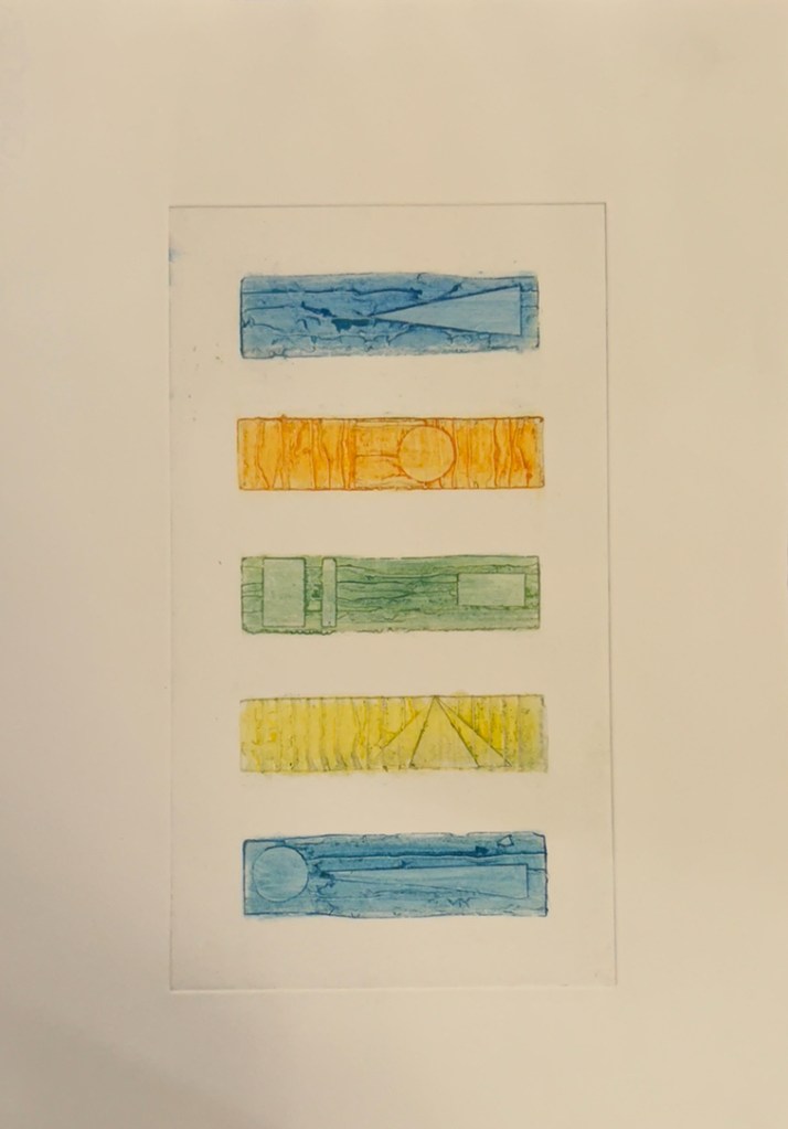
The inking process was extremely difficult. To obtain clean spaces in between the inked squares was almost impossible. The assistance of a small amount of oil finally obtained a satisfactory result. I learnt from this experience to consider how to achieve ‘clean’ gaps. The space between the squares needed to be bigger and a protective mask would assist keeping these sections clean. For the following week I made a simpler version of the same idea to try out the new ideas.
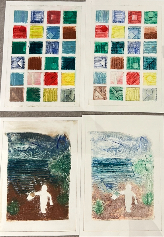
1st inking, now ready for ghost prints.
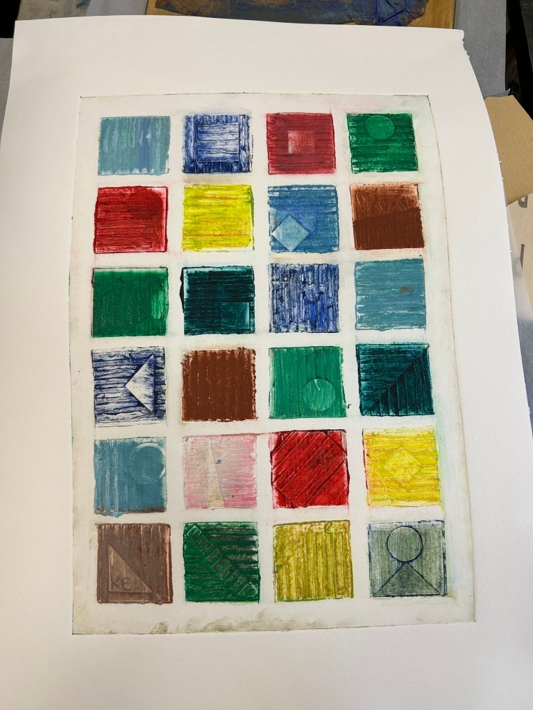
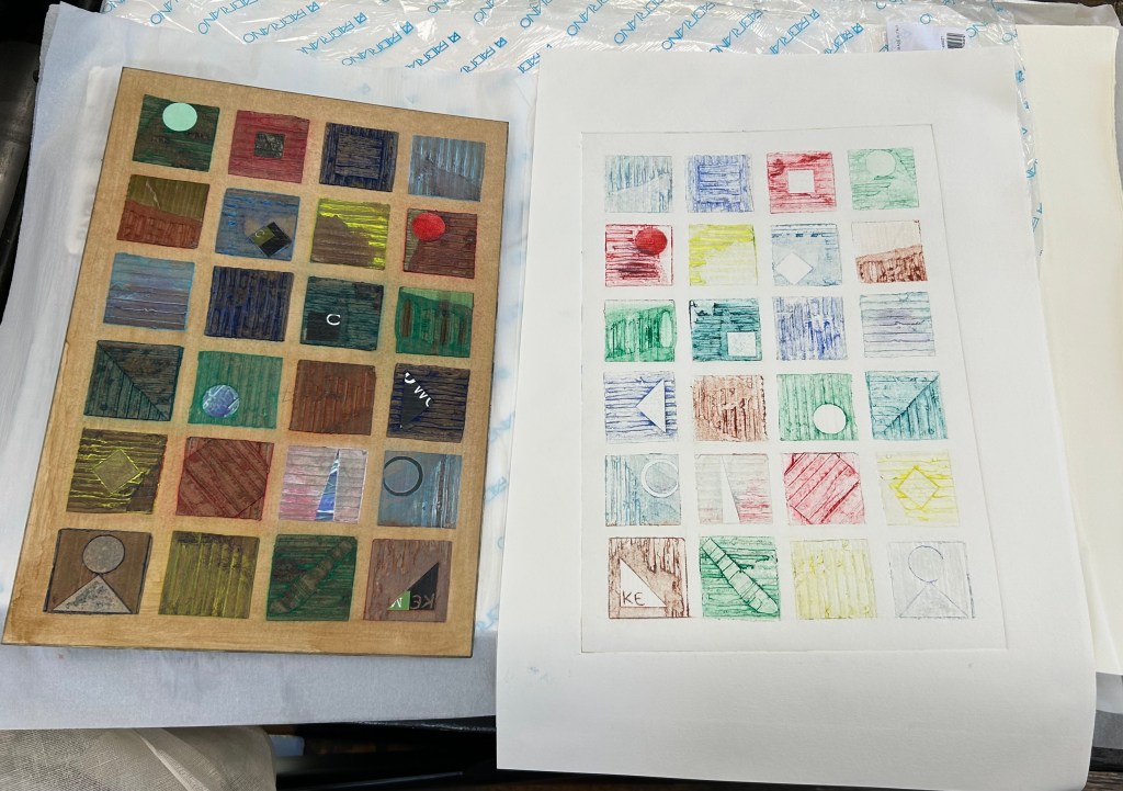
The ghost prints were very successful. No additional ink but further cleaning in between the squares produced a clean appealing end result.
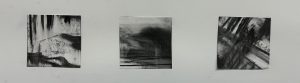
An visual comparison of the ghost printing process
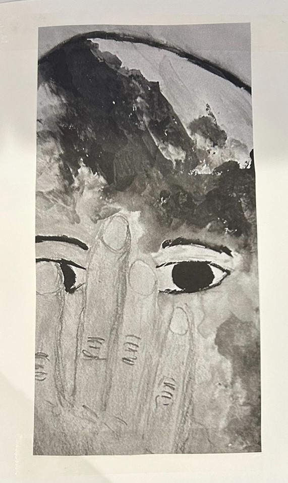
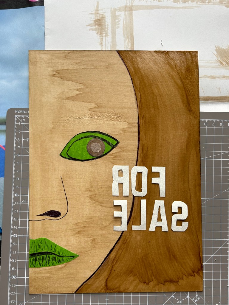
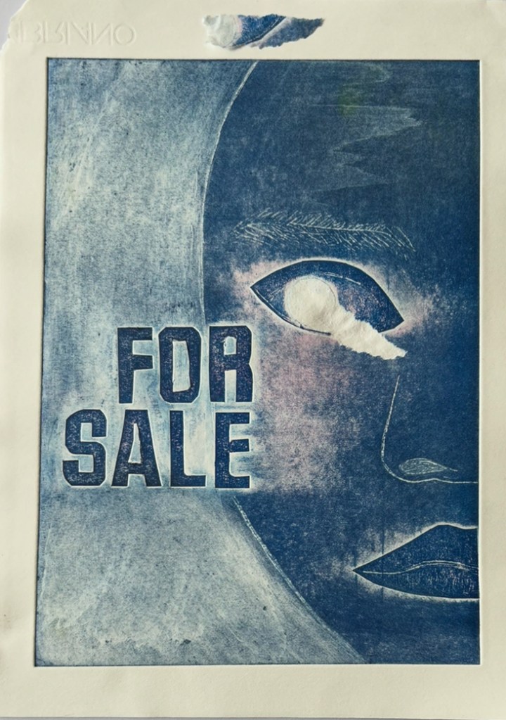
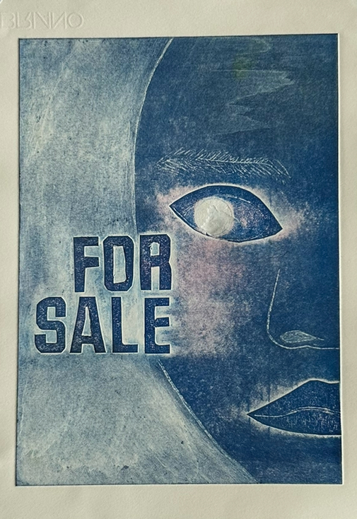
At the end of the lesson I inked up my last plate for a final print. The plate forms part of my work related to modern slavery. Inspired from images used in my Identity project.
Modern Slavery
The plate was made using a centre section cut out from a mount board. The outline of the girl was made using ball point pen, the eyes and mouth done with masking tape and gentle marking with the pen, the eyes finished off with circles of differing textures. The letters were created utilising the ‘paint’ program on a pc to flip the letters which were carefully cut out, tested with a ‘flipped’ photo and then stuck onto the plate.
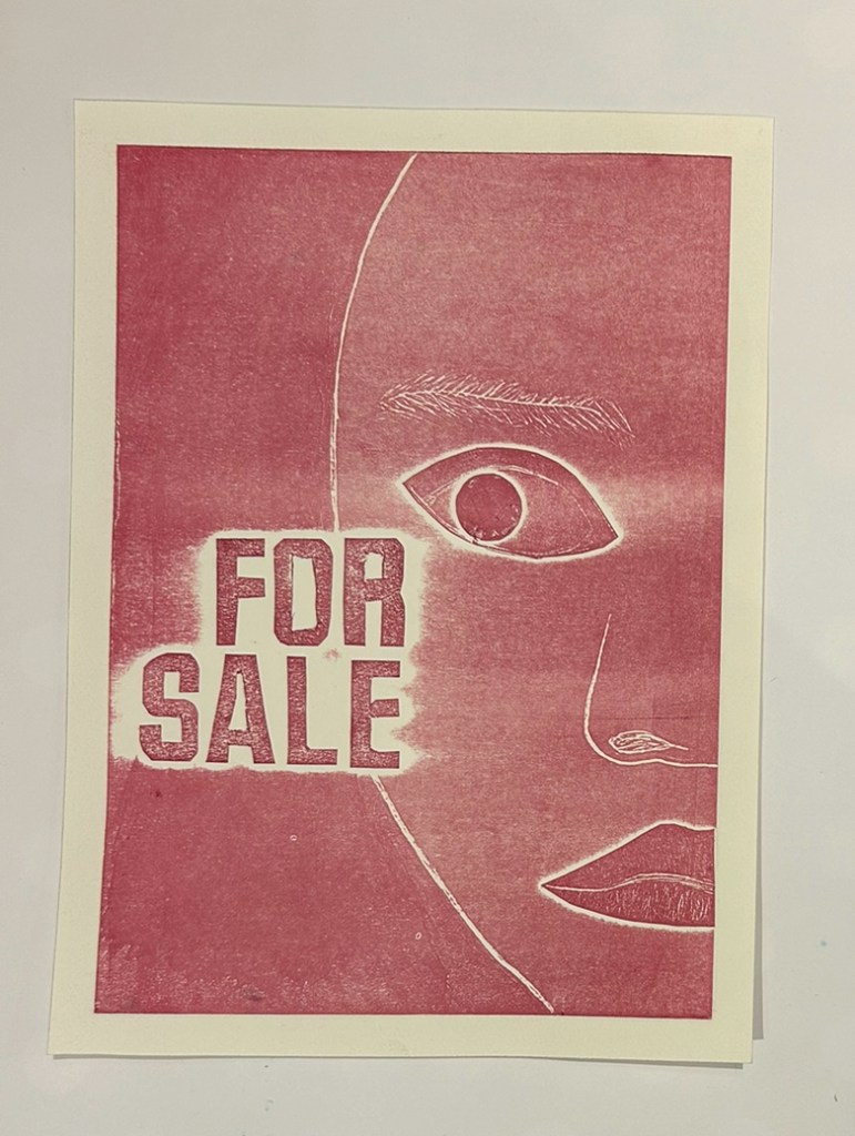
The end result was a very moving and powerful print. The first print was by far the best one, additional prints in various colours did not have the same impact. I am particularly pleased with the fine detail on the mouth and eyebrows. The haunting expression has also been captured in the print.
On trying additional colours I learnt not to rush when removing the tissue paper after the printing process. I spoilt a nice version when pulling the tissue paper off too quickly, removing a layer of paper around the eye.
A missed opportunity for an excellent print!
The week after I produced some new plates to try out my new skills.
Further attempt at raised cardboard shapes with more ‘negative’ space to assist the cleaning process and a template made from thick tracing paper to protect these spaces during the inking process.
1st inking to remove excess ink, although I liked the end result, a happy accident. If I had more time I would have done 3 more ‘accidents’ to produce a series. Unfortunately time was not on my side, it was the last print making session. I was pleased that the concept of the new layout and masking worked well but had insufficient time to produce any perfect prints. If I have an opportunity to use a print studio in the near future I will continue to work with this plate to achieve a better result.
2 Further ghost prints after additional attention cleaning the negative spaces.
Geometric design
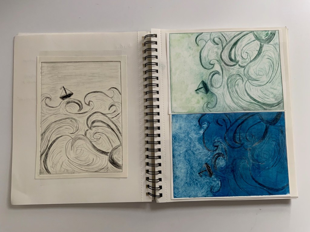
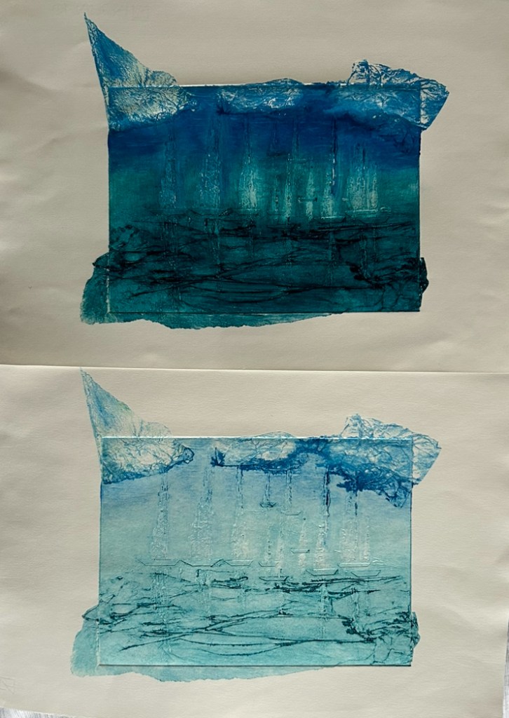
My final plate was a boat scene. The sea and clouds were done with tissue paper, the boat hulls with marking tape, mast with ball point pen and sails with the pva glue.
initial inking and print, plus ghost print.
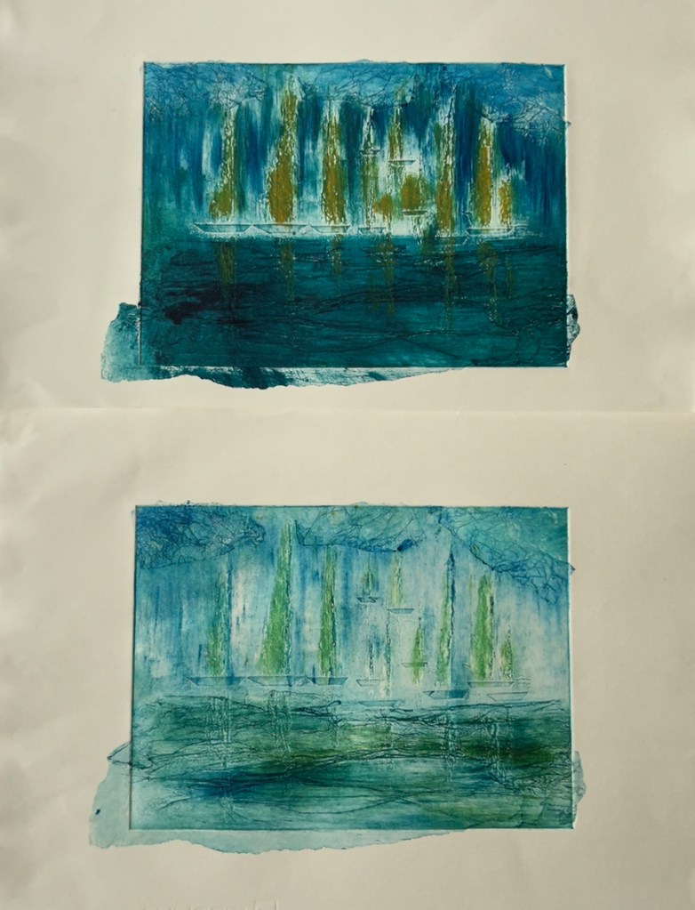
I did more inking in selective parts of the plate, and experimented with adding some watercolour after the print had dried.
The application of watercolour added a new dimension but was applied badly making some of the reflections wonky and some of the sails too bold. I also realised some of the boats made the horizon difficult to place. All of the boats should have been more or less on the same level to differentiate between the water and the sky.
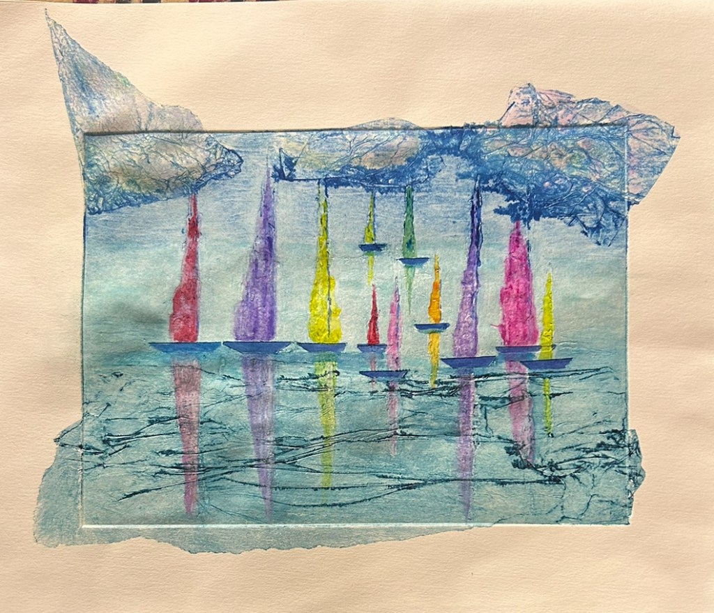
The idea of the tissue paper overflowing on the edge of the board did not work in practice. It looked like it was a mistake in the printing process. The end result would have looked more professional without it.
Unfortunately it was the final session in the printmaking studio and I did not have the opportunity to do any further prints or make a new plate to try the process again.
In summary the 5 weeks spent in the printmaking studio were extremely enjoyable. I approached the first lesson with trepidation due to arthritis in my hands. Brian was brilliant, in the 2nd week he produced a home made device to assist me removing the majority of the excess ink. This device combined with the use of ghost printing made a huge difference to my work, and made the experience a positive one when I anticipated it being problematic.
I tried to incorporate ideas originating from other projects into the printmaking experience. The print of the 2D exquisite corpse and the image depicting a young girl for sale added another dimension to each of their projects.